Wednesday3rd May 2023
L/O: To explore possible tasks and research similar products
1)Create a front cover and a double-page spread article for a health and fitness magazine aimed at an audience primarily 14-18 years old.
-----------------------------------------------------------------------------------------------------------------------------
Wednesday 10th May 2023
Research
L/O: To research codes and conventions of similar products.
1)how to train diffrent parts of your body.
2)Famous actors are on the front cover so people buy it.
3)the colour scheme contrast each other like black,red and yellow.
4)the masthead is at the top of the screen and serif or block font.
5)there is one main image and sometimes a smaller image on the side.
6)there are 8 or 9 cover lines.
7)the barcode is usually placed at one of the bottom corners.
8)there are 3-4 diffrent fonts on the cover they vary from size depending on what they are for.
9)puffs are used to catch your attention.
1)Double page spreads are laid out with one main image then some smaller images and text.
2)they are 5 used to show what the article is talking about.
3)there are 7 diffrent fonts which vary in size depending on what they are on about.
4)the text is organised to fix around images.
1)Double page spreads are laid out with one main image then some smaller images and text.
2)there are 3 images.
3)there are 7 diffrent fonts.
4)the text is organised around the images.
1)how to become strong and fit.
2)there is a famous person to catch peoples attention.
3)the colour scheme is white,red and black.
4)the mast head is at the top of the screen.
5)1 image on the cover.
6)there are 7 cover lines.
7)the bar code is placed in the bottom right corner.
8)there are 5 diffrent fonts.
9)puffs are used to catch your attention.
1)Double page spreads are laid out with one main image then a smaller images and text.
2)there are 2 or more images in a double page spread.
3)4 diffrent fonts
4)text is around the images
-----------------------------------------------------------------------------------------------------------------------------
Wednesday 7th June 2023
1)the house style colours are blue orange black and white. the font on the masthead used is serif.the image is at the center of the front cover.
2) production value the is mid as it is glossy on the outside and matte on the double page spread.
3)the ideologies represented are that being young is good and healthy and to work out to stay healthy.
4)the colour pallet used is bright with colours like blu and orange.the typography used is basic with a serif font
5)the main image is antistereotypical as he is in casual outfit compared to a gym outfit for a health and fitness magazine
6)the target audience is for people 25-35 it appeals to them by using a actor they would know as the main image so it catches there attention
7)you can tell the cover and double page spread came from the same magazine since it says mens health next to each page number.
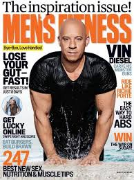
1)the house style colours are red and black.The font used on the masthead and cover lines are both a sans serif font .The image on the cover is in the center. Its layout is to fit around the main image.
2)the production value is low as it matte all the way though the magazine.
3)the ideologies are represented are how to get fitter then you ever can
4)the colour pallet used is red and black on the cover and colour pallet in the double page spreads change but keeps the black font colour the typography used is a sans serif font
5)the main image on the cover is antistereotypical as he is in casual outfit compared to a gym outfit for a health and fitness magazine
6)the target audience is for people aged 25-34 years old this appeals to them by using different types of things on the tag lines which relate to them.
7)you can tell the cover and double page spread came from the same magazine since it says the month and year next to each page number.
.style-the style stay the same throughout the magazines but different colour pallets.The image is in the center of the page with the cover lines fitting around it.
.typography-the typography used is a ether a serif or sans serif font which is carried on through the magazine.Also depending on what your writing the size of the font will change.
.image-most of the time the image is in the center with a mid shot.
.content-the content used is usually on how to stay fit or how to become fit.
.colour pallet-the colour pallet changes on if your doing a front cover and double page spread since the colour pallet on a cover it usually has multipul bright colours but with double page spread it usually sticks to 2.
.dps layout-the double page spread is usually layed out with photos in the center and the text around it
.masthead-the masthead is block capital behind the main image is large and usually in serif
cover-on the front cover there is a main image,cover lines,price,issue number and date.
-----------------------------------------------------------------------------------------------------------------------------
Initial Planing:
.Name- Teen fitness, Teens Health
Tagline- Get fit quick
House style-
colour palette-red,black and white
cover image idea-
cover lines- how to get muscle fast, train to gain, how to lose weight plan, how to get fit quick
DPS article subject work out ideas & possibly recipe suggestions
-----------------------------------------------------------------------------------------------------------------------------
Wednesday 21st June 2023
Adobe Illustrator
L/O: Explore the use of Adobe illustrator to create a magazine masthead or logo.
-----------------------------------------------------------------------------------------------------------------------------
Wednesday 28th June 2023
Target Audience
l/O: To research our target audience to enable successful targeting.
.Target audience 14-18 year olds
cover 1:
.age 20-35
. Gender male
.class upper
.business, technology
.they are educated
cover 2:
. 18-30
.gender female
.interests looking good and make up
.class middle
cover 3:
.age 30-50
.gender male
.interests films
.class middle
Audience profile:
.Age range-14-18
.Gender Male
.income/job-not working or only work a bit as they are in school still.
.Race- all races as it isn't a topic only one race will need.
.education- yes mostly towards people in secondary school,college or university
.interests-to stay in shape and how to lose weight
.there favourite subject wold be mostly P.E
.What would be important to them is how to stay or become fit and never to give up
.They would use social media since most 14-18 year olds do
.My product could appeal to them since it is on mostly how to lose weight and become fit.
-----------------------------------------------------------------------------------------------------------------------------
Wednesday 5th July 2023
In-design
L/O:to explore and understand how to use InDesign for magazine layouts.
-----------------------------------------------------------------------------------------------------------------------------
Wednesday 12th July 2023
-----------------------------------------------------------------------------------------------------------------------------
Wednesday 6th September 2023
Statement of intent
I am making a health and fitness magazine for 14–18-year-olds for a male audience. The people who read this will be interested in fitness and who want to be active also for people who are still in school and like P.E. People who read this will be interested in how to lose weight and train to gain muscle. My magazine name is Teen Fitness the slogan for my magazine is Get fit quick, my specific target audience is a male audience of any race who are interested in staying fit and healthy.
The codes and conventions for my magazine is the colour palette is going to be red, white, and black. The layout of the front cover will be the masthead at the top of the page with coverlines on the side and the main image in the centre the typography used will be serif and sans serif font. The mise-en-scene used will be on how the model looks and acts so he should look happy and confident in what they are doing. This will appeal to my target audience since if they see someone enjoying what they like it might persuade them to get it.
This magazine should look stereotypical meaning it should look like a normal fitness magazine. The Lexus should be nice and simple so people can understand what the magazine is about. The intertextuality focused on one thing at a time so the reader can understand what is going on and what they need to do.
-----------------------------------------------------------------------------------------------------------------------------
Wednesday 13th September 2023
Coursework Review
L/O: To recap brief criteria and to explore how to create effective representations.
magazine:
. My cover will follow the layout conventions of a front cover by including a masthead at the top of the page, a large main image that covers most of the front cover, cover line on the left or right side of the cover a cover price, barcode and edition number.
.My DPS will cover the layout conventions of a DPS by having 4-5 images on it thought out it. Also with either step by step instructions or how to do diffrent exercises. Also to included subheading for diffrent categories.
.The genre will be clear since there will be fitness/exercises ideas and healthy recipes on the DPS and on the front cover thought the cover lines.
.My DPS is about exercise ideas & possibly recipe suggestions
TO DO LIST:
1)Need to take photos: of models(front cover), process of making a healthy recipe and different types of exercises. (DPS)
2) need to write article: on exercise ideas and how to make the recipe.
3) Need to make the front cover: Coverlines, Main image,
4) need to make DPS
5) Get barcode and price
6)
-----------------------------------------------------------------------------------------------------------------------------
Wednesday 27th September 2023
Donow:
1)Great recipe
2)train to gain,
3 )how to lose weight plan
4 )how to get fit quick
5)Best power meal
-----------------------------------------------------------------------------------------------------------------------------
the masthead i'm going to use is
A healthy meal plan:
- Emphasises vegetables, fruits, whole grains, and fat-free or low-fat dairy products(broccoli, carrots, garlic)
- Includes lean meats, poultry, fish, beans, eggs, and nuts(steak, chicken, shrimp)
- Controls portion sizes
Im going to have the recipe be shrimp noodles with broccoli.
exercises for workout:
push-ups
pull ups
squats
lunges
-----------------------------------------------------------------------------------------------------------------------------
Wednesday 1st November 2023
Article Writing
L/O: To create a convincing article for a teen health and fitness magazine using appropriate language tone and representation.
Donow:
interviews
reviews
exercise guides
recipes/meal plans
best equipment to use
best clothing to use
blogs
how to...
fact sheet
profile
problem page
key elements for a dps:
6 images
small writing
diffrent font for titles colours to sperate things
detail in what you are writing
different picture sizes
headline
written in collums
drop caps
pull quote
What you need:
headline
stand first
original images
approximately 300 words


This comment has been removed by the author.
ReplyDeleteRESEARCH:
ReplyDeleteGood research into conventions and great analysis. Well done
TA PROFILE:
Basic but good
PLANNING:
A good start - I like the masthead
I'd like to see more about how you're going to target teens.